Thursday, September 29, 2011

Hard to say – Walkthrough -

DSCN1128
THIS IS GOING TO BE QUICK, PEOPLE.
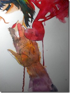
My quick painting, done the sketch at school, painted it at home. This isn’t a how to, just a walkthrough. Let me tell you a warning. I got to carried away when I did this, so I kinda screwed up the details. Sorry :(
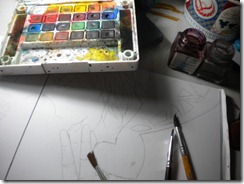
Oh yeah, the tools I used: these brush I found, Koi Watercolour Pencils, paper , 2B 0.7 Mechanic Pencil, eraser my friend gave me (my friend found this eraser out of nowhere, and I keep on borrowing them so he/she just let it go, and gave it to me :) Thankies!), and Sakura Drawing Pen.
DSCN1105
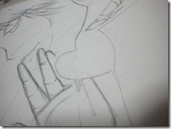
First, let start with the sketch, like I said before, I did this in school, well there was no teacher in my class, so why don’t we just draw a little something something?
DSCN1100
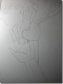
The sketch is too messy to use, the lines are to0 thick so I have to redo it again. Let me fix it. Why is the sketch needs to be clean? Well, to be honest, I don’t know why. Maybe just to give it finesse or something. But, if you didn’t erase the sketch, it will interrupt your colouring, because you probably confuse about which line which so, erase the sketch is better.
DSCN1103
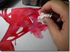
Let’s get on with the colouring. The heart is the main part (also the main idea) of the picture. The hand is also main part but the heart is in the centre of attention so let’s start with them first:
DSCN1108
DSCN1106
Tips: To thin (thinning?) the layer of a colour, you can add more water on to it, and get a tissue and wipe it off. This trick is pretty useful, and I use it almost all the time.
DSCN1111
DSCN1109
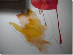
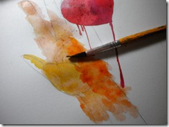
Let’s get on with the other elements. The hand. It’s very realistic, but I chose to colour it like, not realistically. I just want that spontaneous feel about it. that’s why I didn’t colour it with colour for flesh. It’s for my self expression, remember?
DSCN1116 DSCN1117 DSCN1118 DSCN1119 DSCN1120
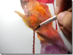
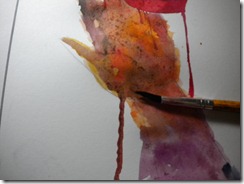
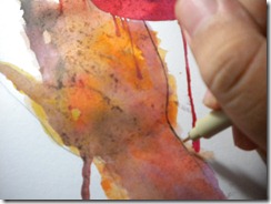
So in the first picture you can see the base colour which is this yellow-brown-golden colour, and then I continue that colour with orange colour, to continue the gradation (second pic) after that I add purple (purplish colour to be exact) It’s pretty shocking right? And then I gave a nice kinda melting thing (?) with paint, that for me it describe vulnerability.
Let’s go to the mysterious person in the back, let’s colour her lips, I want the lips to be sensuous and lively, and make the skin seem dead. Let see:
DSCN1121
Sorry, I didn’t photograph the skin in the making, but If you would like to see my first how to (my first post here) It use the same kind of way, the difference is located in different mediums, but the basic I use in the first how to is the same with the one I use in this artwork I’m explaining right now.
Continue to the eyes. The eyelashes, I line it with paint. The eye colour is blue and bluish-green.
DSCN1122 DSCN1123
After all of the colours are done. Let’s finish with the lines using my drawing pen (Sakura :))
DSCN1125 DSCN1126
This is the end of the walkthrough. (Sorry for the bad English, and I’m kinda in a hurry so sorry for doing this quickly)

See you later,

Keshia

Colours Connect Me with Myself

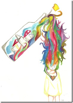
bottle of feelings

WHAT IS THAT SUPPOSED TO MEAN? A lot of you might asked this question to yourself. Being a teenager is hard work. Nobody knows who you really are. They question you (thousands of people asked you) so hard, that you can’t answer anything. A single word doesn’t come from your mouth. Those questions over powered you. Well they over powered me a bit. Those questions people asked you, made you ask yourself.This is the conclusion of all questions that you have to go through: Who are you? It’s as simple as that. But the answer is hard to find.
People may talk like this: You don’t even know yourself. You may start to get defensive, lie to people around you or lie to yourself. How can you put up with something like that? I didn’t know. I DIDN’T KNOW AT ALL.
Sorry, for keep jumping on to something else.
You don’t know how to express. To express yourself as a person, instead of getting caught in this tiring reality. Your dreamscape seem so far away, like those fantasies you have at night. You fall in to this lingering tragic story, to find yourself. Find you, create yourself, in this not-so-welcoming crowd. You don’t recognize that one thing called “freedom of self-expression” You don’t know it at all. I didn’t know that, before. I know it now. How important it is to me.
I know how to self-express for myself. Art help me how. “Colours connect me with myself” that means that colours has help me to find away to be like me. Well this works for me anyways.  Colours connect with me who connect with my emotions. That’s why sometimes I use the term “Colours reflects my emotions” I choose colours well because, to be honest, I’m not a straightforward kind of person. I’m not self-explanatory.
But, I don’t choose those colours randomly. They have meanings (according to me anyways) These are the colours that I primarily used:
  1. Blue → Feeling Blue → this colour represents sadness, coldness, gloom, loneliness, miserable, depressed, rejected, sorrowful, unwelcome, melancholy. I use this colour often (sad people like colours that represent sadness)
  2. Yellow → Feeling Happy → this colour represents happiness, fluffiness, dreamy, cheerful, imaginative, content, ecstatic, “on cloud nine”, euphoric (not always).
  3. Red → Feeling Rage → this colour represents anger, hate, rage, infuriated, outraged, annoyed and mad.
Those are the primary colours that when combined, causing/ creating more colours:
  1. Green → Feeling Blue and Happy (Yellow) → this colour represents peacefulness. Like, it’s between sad and happy. Static kind of way.
  2. Purple → Feeling Blue and Rage (Red) → this colour represents sadness, horror, gloom, loneliness, coldness, anger, hate.
  3. Orange → Feeling Happy (Yellow) and Rage (Red) → mostly this colour represents cheerfulness and give that warmth or a warm feeling to an artwork.

Sometimes two colours can represent themselves well, without the other colours, because they’re self-explanatory. But, there are this controversy about whether they’re colours or not. They’re black and white, the straightforward colours.
  • Black : it signifies sadness, loneliness, gloom, miserable, depression, horror, afraid, danger, or maybe just that feeling when you feel trapped in a underground place, that is so dark and unusual.
  • White: it signifies the opposite things that black implies. White is more peaceful, angelic, sublime, heavenly, magnificent, graceful, poise.
Well, they are all my palette when I’m expressing myself. I combine all of them when I’m in turmoil or my emotions got mixed up, and I’m confuse about what should I feel.
This kind of expression works for me. I like this kind of way to be myself and in the same time, I cheer myself up.

Tell me, who want to keep their feelings so deep inside and never let it go?

- Keshia

Wednesday, September 28, 2011

A Swirl in my Art

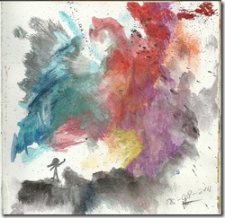
Every time I feel tense, annoyed, furious and rage, I just stop holding a pencil. Those kinds of feelings are the usual things that caused me to stop drawing. Sometimes, I just sit on my chair and stare at the blank paper, because of all of this rage inside of me may tear it. I don’t work with that kind of feelings, maybe I do (sometimes rage can bring my instinct to a higher level) but most of time it doesn’t work. But something change my mind lately. Instead of holding a pencil when I’m mad, I hold a brush. A wet brush and colourful palette are like my medicine to calm myself down. The colours aren’t predictable, the heart wants what the heart wants. Sometimes it’s only black and blue, if I’m sad. It depends on my state of heart. That’s why sometimes I can’t lie, and can’t talk about what I’m actually feel inside. The paints sometimes speak for me. The colours speak for me.

scan0008

We’re humans, we fear imperfection, crave for perfection. But sometimes, perfection or the thought of being such a perfect being scares us. Well, I have to admit, my artworks aren’t perfect. Some people say that “That is totally wrong”, when I say that to the deviantart friends, they just said “There are no wrongs in art, artist express what they feel, and some imperfection causing that perfection itself” I just realized that a while ago. Sometimes, getting something right can be such a relief, but sometimes It scares me a bit. I don’t know why, though, perfection makes things a little bit intense.

When I asked myself: “What if I see an imperfection in my artworks?” Answer: It’s usual to have that kind of question. Well, if I see one, I’m just trying to let it go, if I can mend it, then I mend it.  Those kinds of imperfection that I saw in my artworks sometimes kinda funny, but aren’t fixable. Still, imperfections are just signs that give you a thought, and make you realize that you got something to improve on. I like that thought. Maybe you’ll find perfection inside an imperfection, who knows?

Feeling Blue. This is just one of that sad moments, whether I feel lonely, invisible, or basically anything that can make me crying. These feelings, usually, almost every time, I expressed in my art. My style for “feeling blue” is realistic. It’s the opposite of “feeling yellow” . I don’t know why I used a realistic style. Maybe I’m just thinking that the real life is more sad than the fantasies I have.  And If i use realism (realistic style) you just get that feel of atmosphere (sad atmosphere) easier than if I use anime/manga. Realistic are just those styles that are really strong and powerful, but it can show a vulnerability (not a minus or a disability) of a picture.

Feeling Yellow. These feelings are the opposite of “feeling blue” Happiness is one of these feelings. I interpret this feeling with yellow colours. My imagination usually just takes off, and speaks. This kind of feelings causes me to be hyper or maybe just have a high imagination. It’s more fun when you imagine something, than actually going through it. I use manga/ anime/ cartoons/not realistic style on this kind of artworks. If use realistic, you won’t get that imaginary, fluffy, fuzzy, fun, cheerful feel. The atmosphere I try to give to this kind of art is usually a warm atmosphere (it’s just make people feel welcome, right?)
So these things cause a swirl in my art works. What’s yours?

- Keshia

Saturday, September 17, 2011

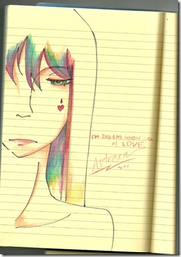
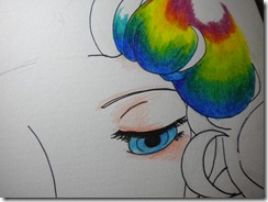
How to layer different colours using colouring pencils.

scan0002
See the colour of her hair? It’s layer of many different colours in to one. How can you do that? Ask many people to me. Let me show you how to colour something like this.
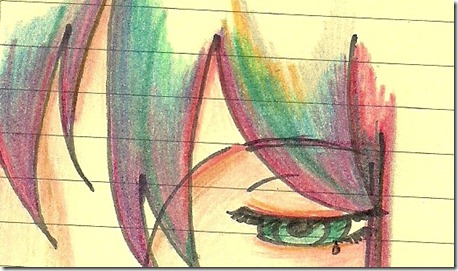
First lets zoom in to the picture, see the shades that I’ve made, and what the colour turn to:
crop details
So clearly you can see what I use, a shade of purple mostly, for the area near her face (maybe just to give that shadowy look for her hair), pink because this piece tends to get pinkish, a blue-purple colour, just to make the gradient doesn’t look to awkward, green, dark green (this is where her hair starts to light up, because its going for the light), yellow (just to continue that green and to make a picture more colourful (for beauty)) If you can see this, that’s actually an essence of grey.
So here is the colours I used layer by layer:
  • Grey : The base colour of her hair mostly
  • Purple: The darks ends of her hair, give that more feminine look.
  • Pink: To continue the purple, but brighter.
  • Blue- purple: It’s also for the gradation mater, but not use in all of her hair.
  • Green: The one I use is the same colour as her eyes, the green is a continuation of the gradations in her hair.
  • Yellow: mostly about the light. And it works together with green.
If you want a balance gradation, be careful about mixing them, cause the colours, when mixed up can make a picture die, or not as energetic or as colourful. Be careful, but at the same time, take courage and be brave, you never know what an outcome of a mix without trying.
Step by step how to colour (I don’t use the same picture sorry ^.^)
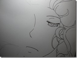
  • First, create a lineart, I draw my own drawings, this is one of them:
DSCN1053
 

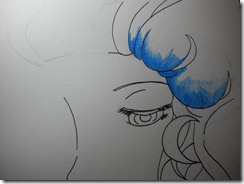
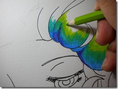
  • Colour what you want the atmosphere to feel like. in this one, I try to kind of, bring that sea, and night feeling so, for the hair near her face I want blue so here it is:
DSCN1054

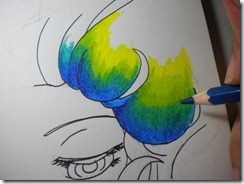
  • Again, I kind of want to darken the hair, and then I add the green one: green is used to continue the gradation and combination.
DSCN1057
  • Add a lighter green, like I said before, go to the light, in direction of the light.
DSCN1058
  • Now, enough with the light, lets continue with the dark colours. Between the first shade of green and the blue. And if you want to do a more balance gradation you can also shade dark blue between the first green and the second green.
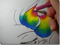
  • Obviously, you saw the yellow, it’s to continue the shade of green. The yellow needs or for the best results use a light yellow, or a yellow that is close to lime green, or the green you’re using.
DSCN1059
  • Yellow goes with red, but let me tell you something, yellow + dark purpleish pink = reddish colour. This exceptional and incredible gradation and changes is one of the reason why you have to be careful and be brave.  TRY! TRY! TRY!
DSCN1060
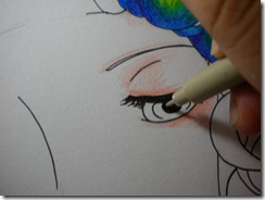
  • Now, I’m just going to shade the skin around the eyes.
DSCN1061
  • The dark centre of the eye (I use drawing pen – Sakura Drawing Pen – )
DSCN1062
  • The eyes: light blue- blue
DSCN1063
  • DONE! Well that’s about the shading and layering the colours. Oh yeah, the final result, I will post it later! :) Thanks!
Oh yeah the colours I used: purple, blue, teal blue, dark green, lime green, yellow (light), dark purpleish pink.
Tools:
  1. Paper (sketchbook paper, copy paper, or anything)
  2. Pencil (2B and HB for sketching)
  3. Drawing pen (Sakura, i don’t know what size I’m using, between 0.3 to 0.5, around those sizes anyways)
  4. Colouring pencils . (I use Faber- Castells, the price isn’t too expensive)
  5. Eraser, to erase the sketch.
Tips:
  1. Be careful. Using different colours in one gradation/ layering them can surprise you! Watch out for negative surprises like the colouring can cause the picture too dark, not lively, or not colourful. But if you’re aiming for a dark atmosphere, use different dark colours and the light colours are just for highlights or to give a sense of life.
  2. Be brave. Be bold. Different colour can surprise you! Watch out for surprises! :D

That’s all for now! I’ll upload the final result soon!

- Keshia S