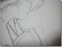
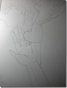
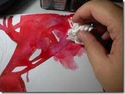
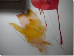
Monday, December 5, 2011

Busy!

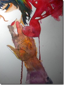
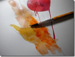
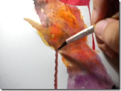
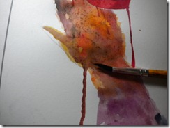
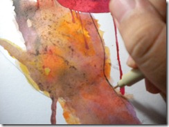
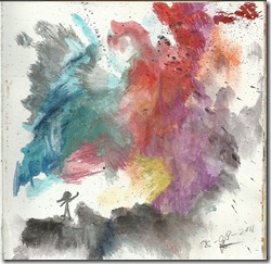
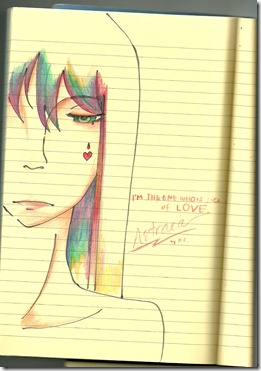
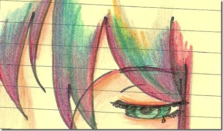
Hi guys, I haven’t been on lately. Whether on this blog or deviantArt. Busy school days and many exams, so usually I just do some painting, involve emotions of course.


And I’m going away next week, so maybe I update my deviantart and blog too.


Bye For Now,


Keshia

Thursday, October 27, 2011

Free Tree

scan0007

watercolour on watercolour paper.


-Keshia

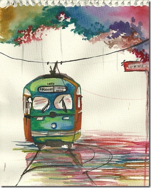
Train…

I did this last night! Based on a postcard my brother gave me from US. San Francisco.

scan0008

A little bit imaginary I think. Watercolour paint on watercolour paper.


-Keshia

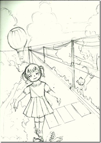
Mood for Perspective

I’ve been thinking about landscapes recently, and found drawing it very hard and amusing at the same time. Me, a person who don’t have nothing to do, or know what to do with perspective just drew something this morning. School was, you all know how school is. I’m thinking about an imaginative and magical place called “Not-School” And somewhere behind those ideas turn in to actions on a piece of paper. Pardon me, for being completely and utterly amateurish and feel intimidated by something like perspective. Yeah, the p word.PERSPECTIVE. Something that is really hard for me to draw with. Perspective can be a good partner and it can be an intimidating partner to be around with.

Sorry, for being such an amateur in perspective, this is what I did:

blog0003

I tried. :)


-Keshia

Sunday, October 16, 2011

Line. Coloured. Edited


When I made an artwork, I also consider when I scan this piece do I need a photoshop? Some works do need a Photoshop touch.

Caption: The left one is no-edited, the centre is lineart-only, the right one is the Photoshop edited version.

Photoshop helped us in so many ways. It brings out the colour if you set the settings. It really works and I really like working with it. Especially if the scanner made all of the colour fade, oh yes my friend, you really need a Photoshop help!

The usual ways I use in Photoshop: make a new layer above the original work. Colour the layer colourfully or just choose the colour that go well with the original work. Choose overlay.

Sometimes overlaying colour tends to make the colour disappear so, do with all your power to prevent that from happening, Photoshop will help you how!


Some person who sometimes like to edit with Photoshop,


- Keshia

Saturday, October 15, 2011

Fast Art Stuff: Who Cares?


This piece is interesting enough to talk about. It’s one of my favourite. It has this unrevealing story behind it, that’s tragic but at the sometime really sad.


It’s about a girl. Who need to be listened. No one realize her. Until she get hurt all by her self. Alone in the unforgiving world full of deceitful people all around. Who cares about what I’m feeling? She said. She just stand there like nothing around her make her move. Close her eyes, and realize the only who listen to her is herself and God. and that’s enough for her.
Nobody knows or cares or understands about what her state of feelings  are. She want to say goodbye, if she is never be appreciated by anybody. People would leave her in the corners, left her sobbing in to the night. To the darkness and the light comes in the next day, but no one would knock on her door.  Nobody cares. So that’s why she asked:
Who cares?
Multiple times and counting them all, one by one.
During times of universal deceit, telling the truth becomes a revolutionary act.
- George Orwell
I found that quote just recently. And those two paragraphs just tell the story behind what I drew and paint.
It’s kind of look death , and gothic style in some parts especially the red lips. Yeah, I don’t know why did I do that? But all and all it came out beautiful. I think she resembles my Original Character named Astraea or maybe the sister Virtue. But I’m positive this is Astraea. These OC’s of mine are sisters. Their hair are very colourful according to my state of emotions. I haven’t drew both of them in a while so this one is kind of give me a feeling of relief cause at some what they’re still alive.
“Who Cares?” Is really self expression kind of art. I did it with paint, drawing pen, and pencil. I sketch them up in the car and then ink it while there was a activity in my church, and paint it right away when I’m home. I was really angry at someone back then and maybe that anger got the best of me at some point. And this picture show me that side of me.
This artwork works for me, and I got the message. But that doesn’t mean as long as I understand it the picture is okay. I hope people who see this artwork see the message too.
Tools:
  1. Koi Watercolour Paints
  2. 0.7mm 2B mechanical pencil
  3. Eraser
  4. Drawing pen
That’s all for now,

- Keshia

Note: I got emotional push from this song: Exit Wounds by The Script http://www.youtube.com/watch?v=gYehN7mWMyU

Fast Art Stuff: Having Fun, Boy?


You don’t know what will come  in a strange deserted and black paper.  When you put a little mark on it, your mind start to wonder. Like this blog. All along this blog was just an assignment but when I’m working on this blog, I really get in to it. For who ever is wondering what this blog is  about (teacher, that’s you) This is an Art Blog, I just throw everything in here like this post is some kind of blank paper. Everything goes. For the next post, actually I don’t know what I’m going to talk about, another tutorial, another walkthrough maybe, or maybe some posting from my old blog. Oh yeah. my old blog. Let’s start with that shall we?

_______________________________________________________________________

I start my artwork "Having Fun, Boy?"  'cause of Owl City. I mean Owl City. The synthpop electronica one-man band. The songs are playful and fun, and so high imagination. The tunes go up and down, and synchronized with the lyrics, and the keyboard sound, and the singer vocals, play around the song make it so beautiful.

Because of the lyrics, I start building concepts. Concept I took for this piece is what the song said about the surroundings. It’s pretty descriptive sometimes, but it’s still pretty hard. What if I interpret this part that way, this way, maybe other ways? What about the lineart, the colors. Is it going to be dark and horror, or light and playful? It’s kind of hard when you start thinking about the lineart for a piece. Detailed or outline only? In the end “Having fun, Boy?” Probably is the hardest and most detailed artwork I’ve ever done. Mostly maybe because of dedication. :) 

When you finished something (concept) sketching on a piece of paper made you turn your brain again. Because sometimes, not all of the concepts you’ve been thinking about is going to fit in one piece of paper. Remove this, remove that, there were a lot of erasing. Maybe I lost my eraser on the way.

A thing that I really troubled with in this artwork is the boy’s hand. Some part need some perspective (annoyed, I’m no good with this perspective) A thing that I really loved with in this artwork is not all the imaginative stuffs are real and they don’t really need perspective. Just let your imagination run wild! After I finished the sketch let’s get on with inking it.

Ink. Hard. Really now, I’m serious that this is hard. I mean, When you see the sketch, inking is one obstacle that you have to through. Key to inking: stable. Your hand must be steady and flow correctly, follow the lines you’ve made in the sketching step. Watch out for details and if you want to change something in the inking stage you better think twice, be careful.

I color the picture a few days after the inking and the coloring takes a few days as well (including the art block of colors) I mostly used faber-castells classic color pencils, but to smooth the boy's  and angel's face I used faber-castel;s watercolor pencils. Why watercolor for the face? Because it much more smoother than If I used coloured pencils. Most of the technique or ways are gradation and layering (check out my First Post ) I really like this process although it took me so long just to finish it.

Tools:

  1. Faber Castell Coloured Pencils
  2. Faber Castell Watercolor Pencils
  3. Snowman Drawing Pen (forgot the size)
  4. 0.5mm 2B lead mechanical pencil
  5. Eraser
  6. The back of a manga paper :)

That’s about my artwork,


- Keshia

Moon Cloud – Walkthrough Part 2-

Hi guys! I’m back with the walkthrough for ya! So after Moon Cloud - Walkthrough Part 1- there is part 2, this one! Mostly we’re going to talk about the clouds on Moon Cloud. The clouds will be colourful, mysterious and bizarre! So let’s go

 DSCN1140

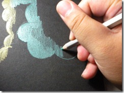
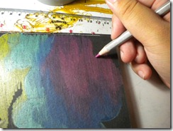
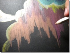
After I finish the moon (see my previous post) let’s continue with the clouds. First of all, is the light. If you see the moon it have this reflective yellow colour from the cloud, so the cloud is the source of light. I’m using yellow metallic pencils with some help from white coloured pencils. The start is from the upper part of the paper to the end part. I shade from top to bottom the shading get thinner and thinner which means that the light is slowly disappearing from the cloud.

 DSCN1144

Next, I made a cloud inside the big cloud (it’s to separate the colour so it doesn’t get mixed up and ended up weird) I begin with a light shade of green (metallic green) and as I go to the bottom of the small cloud, the shade should get thicker. Why? Because when I finished with the small cloud, I will do the big cloud again that will have a different shading (the big cloud should be not as thick as the small cloud) According to me anyways.

DSCN1145

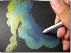
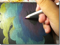
After finished the green colour, lets make a gradation using blue. I like to make it thick (^_^) It’s fun :) Gradation can be done with this metallic pencils and you can smooth the gradation with brush and water. Metallic pencils work with water well.

DSCN1147 DSCN1146

Continue the gradation like I usually do. Purple and Pink what more can you ask for? Shade it with the same direction as you shade before. If you don’t shade it like the way you did before, it becomes weird and un-enchanting. For me when I’m using metallic pencils the gradation are: Green –  Blue – Purple – Pink – Red – Copper – Yellow – Gold . I like to put silver between green and blue, because it give that cold feeling. And for Red, Yellow and Gold I like to put Copper because it almost look like orange in the regular coloured pencils.

DSCN1153Weird Tip: So, I don’t want to recklessly just ruin the gradation or the shape of the small cloud. There have to be some room between the small cloud and the big cloud, so why don’t we just add some light below the small cloud. It made the picture less awkward. :)

Next, as I said before I put silver between green blue yes, I did. Silver and White between green and blue and across the pink and purple, why? Because I want to give it a speed appeal and apocalyptic for some reason.Let’s continue to the big cloud :)

The big cloud is really simple. The gradations are: Yellow – White – Red – Pink – Copper.

 DSCN1155   DSCN1158

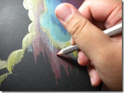
Because the copper is near the finishing point, I made it the biggest shade of the whole picture. The techniques are the same with the small cloud. You think you need special methods when using metallic pencils? Oh no, think again my friend, no. Just have fun like you have fun using regular coloured pencils. Like me :)

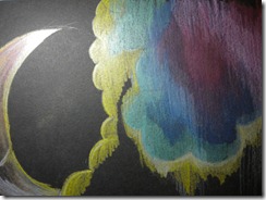
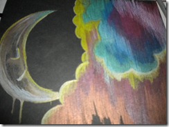
This is the finished product:

DSCN1162

(My bad camera) Okay that’s for now!


- Keshia

Friday, October 14, 2011

Moon Cloud – Walkthrough Part 1-

So, I will divide the walkthrough to two parts (mainly because I’m so lazy) I’ve been telling you I’m going to upload a walkthrough about metallic pencils. This is the first part, I did this a few weeks ago (or more) and didn’t continue it because the next day is school day or it’s sleep time.
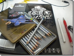
So this is a walkthrough for metallic pencils, I’ve been using them since my birthday this year. It’s really useful, and I like this more than glitter (oh yeah, they are two different things aren’t they?) But, you have to use metallic pencils on black paper, so the colour will show. I buy the black book after, and before I got this textured black paper. But now, I use Canson Black Pad. It’s thickness is medium but useful if I use brush. Oh yeah, the metallic pencils by Derwent are water-soluble. So it works like watercolour pencils. I’ve done many artworks with metallics (mostly I draw moon, helicopters, clouds)
Not only I use Metallic Pencils I also use white-coloured pencils (if you buy coloured pencils, you want to draw with black pad, you can use the white colour) just to even the light or something.
Let’s go
DSCN1072
My tools: Black Pad, Metallic Pencils, White Coloured Pencils, regular 0.7 2B mechanical pencil, eraser (usb connector eh? no, it’s a cameo)
DSCN1070
Sketch up! Draw the outline what you want the picture to look like! I just draw a moon, you know, it suit the paper and the colours. I really in love with this black pad and metallic. I use regular pencils here, you can also use white coloured pencils as an alternative for you. Just use pencil that will show on a black surface, or at least you can see the sketch. I recommend please, no drawing pen on a black pad. I just thought of it now, and never try it. Ah maybe sometime later, but no drawing pen is use here. Good things about black pad and metallic pencils, let them show the silhouette, no drawing pen needed.
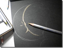
DSCN1081
After you finish the sketch, let’s start with the outline/ get help from metallic pencils. I use gold in this picture. Just to give marks you know. To line it, the gold for me works like the drawing pen ( no actual drawing pen used) Just smooth them up, tidy the sketch, and use the gold pencil to give a sketchy-tidy-unique look. But don’t colour them. Give a line and colouring are two different things.
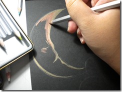
DSCN1082

Colour slightly and slowly! I start this with Copper or Bronze. Between them actually. Maybe I use both. Just colour from the start point. For me from the moon upper part and then around the eyes, then a little bit on the lips. When I colour around the eyes, I sort of also give a mark where should I place the eyes. Nice, right?
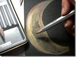
DSCN1083
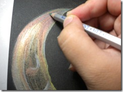
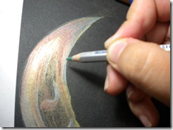
Now, full time colour! the colour I used is gold. Just go with the flow of your drawing. For the moon I follow the crescent moon, not across it, or straight down. If you don’t get it, me neither. It’s kind of hard to explain. I’m confused. But colour with the flow. You can make gradation with these pencils and they work just fine. There are some thick parts and then there are thin parts. Or maybe even parts. Just colour the way you like it.
DSCN1084 DSCN1085 DSCN1086


I added white, green, blue. Why? Because I will play with lights when I work on the clouds. So the shine have to reflect on the moon’s surface. I really like adding this. Is out of the ordinary. Who thought adding colours that don’t go so well can add texture, light, and gradation?
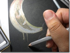
DSCN1088
Suddenly I want to add a watery feeling. Can I? I can. You can too. If you change your mind in the middle of working and you think your idea is better for the picture and yourself, just added them in. I use gold here. For the shine and watery feel. Just go with your ideas, let them shine! And the flow too :)
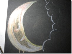
DSCN1090
This is what we have now! I’ll tell you the clouds later (that’s the fun part) :)
Enjoy, wait for the part 2!

- Keshia
Pencil Container

Of course all of you know what coloured pencil is. This media probably is the most known art media. It’s easy to use and people use it often. You can even fix some mistakes using this coloured pencils. This also a good starting point for people who want to colour their works. This is my personal favourite media other than watercolour paints. You can handle coloured pencils like you handle any other pencils.

You can mix colours with coloured pencils. They’re pretty useful for creating new colours. You can layer the colours without actually tear the paper. I really enjoy using these pencils. They are affordable too. Well, if you choose the brand well. If you’re a starter or whether you're a pro, simple basic colours that coloured pencils produced are always astounding. They can be elegant, creepy, emotional, beautiful or imaginative. Coloured pencils are easy to use, handy, and fast. You can sketch with these pencils! I use them sometimes, because in my pencil container on my desk, I can’t find regular pencils, there are only coloured pencils.

When I was young (real young) I use crayons and really fond of them. They’re really expressive and I always excited when I got a new set of them. I really liked the set where there’re 48 different crayons inside. But, it’s really expensive so 24 is fine.  Since kindergarten until about the 3rd grade maybe I used crayons often. Crayons are really enjoyable, but it’s kind of hard to control. If I place my hands on them, they will fade/ discolour. The tip of a crayon is really big too so you can’t actually make exact details with them. So in the third grade until the fourth grade I escaped crayons and started something else, like coloured pencils. I really liked them because of their easy grip and also they’re good for adding details. In the fifth grade, well back to crayons. There is this after school activity and the main media is of course crayons. But, in this fifth grade, I learned about shading with pencils, acrylics, watercolour (a bit) I used crayon again.  And then on the sixth grade to ninth grade I used watercolours, coloured pencils, water-soluble pencils and sometimes soft pastels.
There are many types of pencils that I have, most of them are water-soluble (a.k.a watercolour pencils) and coloured pencils. And I have this pack of Metallic Pencils by Derwent (my birthday present. trust me It’s not CHEAP. If it weren’t for my birthday I would not get these metallic pencils. Seriously) Metallic pencils can be used on a white surface but It will not show, so I use black paper instead. Maybe I’ll post my walkthrough for metallic pencils.

My top choices for coloured pencils are: the lovable, Faber-Castell (reliable, affordable and colourful, versatile colours) and  Derwent (not really cheap, professional, reliable)

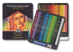
My wish list for coloured pencils: PRISMACOLOR (coloured pencils I ALWAYS HAVE AND ALWAYS WILL WANT) LOL.

That’s my coloured pencils,

-Keshia

Monday, October 10, 2011

Old Stuff

I know this blog is supposed to be long boring and un-attractive because it’s a assignment blog. But, because I recently said to myself that this blog is going to be my main blog, I’m thinking about putting some of my old works here. (teacher, please, this is my artblog)
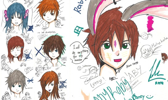
So I did this works in my seventh grade:
I don’t know why I did this. But there is one special original character that I liked very much, and I still draw that OC from time to time now. I really liked anime/manga but it kinda stopped in my eight grade. These pictures bring back memories. The time when  all of us are still good-best friends! :)

I used a little copic (EXPENSIVE) and marvy markers (close to copic) of couse the shading and then the critical stuff is critical but it's fun doing this. I also used drawing pen, and pencils. Maybe I'll redo it to see how far I've gone. You may see some handwriting from my friend, mine, and everybody who came across these pictures. And of course they're Indonesian.
These pictures supposed to have a story but I kind of forgot it. Or type it somewhere. But here they are:
*The bunny, it’s really is a funny story :)

Thursday, September 29, 2011

Hard to say – Walkthrough -

DSCN1128
THIS IS GOING TO BE QUICK, PEOPLE.
My quick painting, done the sketch at school, painted it at home. This isn’t a how to, just a walkthrough. Let me tell you a warning. I got to carried away when I did this, so I kinda screwed up the details. Sorry :(
Oh yeah, the tools I used: these brush I found, Koi Watercolour Pencils, paper , 2B 0.7 Mechanic Pencil, eraser my friend gave me (my friend found this eraser out of nowhere, and I keep on borrowing them so he/she just let it go, and gave it to me :) Thankies!), and Sakura Drawing Pen.
DSCN1105
First, let start with the sketch, like I said before, I did this in school, well there was no teacher in my class, so why don’t we just draw a little something something?
DSCN1100
The sketch is too messy to use, the lines are to0 thick so I have to redo it again. Let me fix it. Why is the sketch needs to be clean? Well, to be honest, I don’t know why. Maybe just to give it finesse or something. But, if you didn’t erase the sketch, it will interrupt your colouring, because you probably confuse about which line which so, erase the sketch is better.
DSCN1103
Let’s get on with the colouring. The heart is the main part (also the main idea) of the picture. The hand is also main part but the heart is in the centre of attention so let’s start with them first:
DSCN1108
DSCN1106
Tips: To thin (thinning?) the layer of a colour, you can add more water on to it, and get a tissue and wipe it off. This trick is pretty useful, and I use it almost all the time.
DSCN1111
DSCN1109
Let’s get on with the other elements. The hand. It’s very realistic, but I chose to colour it like, not realistically. I just want that spontaneous feel about it. that’s why I didn’t colour it with colour for flesh. It’s for my self expression, remember?
DSCN1116 DSCN1117 DSCN1118 DSCN1119 DSCN1120
So in the first picture you can see the base colour which is this yellow-brown-golden colour, and then I continue that colour with orange colour, to continue the gradation (second pic) after that I add purple (purplish colour to be exact) It’s pretty shocking right? And then I gave a nice kinda melting thing (?) with paint, that for me it describe vulnerability.
Let’s go to the mysterious person in the back, let’s colour her lips, I want the lips to be sensuous and lively, and make the skin seem dead. Let see:
DSCN1121
Sorry, I didn’t photograph the skin in the making, but If you would like to see my first how to (my first post here) It use the same kind of way, the difference is located in different mediums, but the basic I use in the first how to is the same with the one I use in this artwork I’m explaining right now.
Continue to the eyes. The eyelashes, I line it with paint. The eye colour is blue and bluish-green.
DSCN1122 DSCN1123
After all of the colours are done. Let’s finish with the lines using my drawing pen (Sakura :))
DSCN1125 DSCN1126
This is the end of the walkthrough. (Sorry for the bad English, and I’m kinda in a hurry so sorry for doing this quickly)

See you later,

Keshia

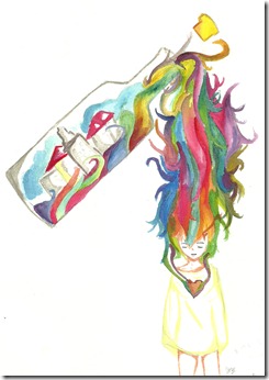
Colours Connect Me with Myself

bottle of feelings

WHAT IS THAT SUPPOSED TO MEAN? A lot of you might asked this question to yourself. Being a teenager is hard work. Nobody knows who you really are. They question you (thousands of people asked you) so hard, that you can’t answer anything. A single word doesn’t come from your mouth. Those questions over powered you. Well they over powered me a bit. Those questions people asked you, made you ask yourself.This is the conclusion of all questions that you have to go through: Who are you? It’s as simple as that. But the answer is hard to find.
People may talk like this: You don’t even know yourself. You may start to get defensive, lie to people around you or lie to yourself. How can you put up with something like that? I didn’t know. I DIDN’T KNOW AT ALL.
Sorry, for keep jumping on to something else.
You don’t know how to express. To express yourself as a person, instead of getting caught in this tiring reality. Your dreamscape seem so far away, like those fantasies you have at night. You fall in to this lingering tragic story, to find yourself. Find you, create yourself, in this not-so-welcoming crowd. You don’t recognize that one thing called “freedom of self-expression” You don’t know it at all. I didn’t know that, before. I know it now. How important it is to me.
I know how to self-express for myself. Art help me how. “Colours connect me with myself” that means that colours has help me to find away to be like me. Well this works for me anyways.  Colours connect with me who connect with my emotions. That’s why sometimes I use the term “Colours reflects my emotions” I choose colours well because, to be honest, I’m not a straightforward kind of person. I’m not self-explanatory.
But, I don’t choose those colours randomly. They have meanings (according to me anyways) These are the colours that I primarily used:
  1. Blue → Feeling Blue → this colour represents sadness, coldness, gloom, loneliness, miserable, depressed, rejected, sorrowful, unwelcome, melancholy. I use this colour often (sad people like colours that represent sadness)
  2. Yellow → Feeling Happy → this colour represents happiness, fluffiness, dreamy, cheerful, imaginative, content, ecstatic, “on cloud nine”, euphoric (not always).
  3. Red → Feeling Rage → this colour represents anger, hate, rage, infuriated, outraged, annoyed and mad.
Those are the primary colours that when combined, causing/ creating more colours:
  1. Green → Feeling Blue and Happy (Yellow) → this colour represents peacefulness. Like, it’s between sad and happy. Static kind of way.
  2. Purple → Feeling Blue and Rage (Red) → this colour represents sadness, horror, gloom, loneliness, coldness, anger, hate.
  3. Orange → Feeling Happy (Yellow) and Rage (Red) → mostly this colour represents cheerfulness and give that warmth or a warm feeling to an artwork.

Sometimes two colours can represent themselves well, without the other colours, because they’re self-explanatory. But, there are this controversy about whether they’re colours or not. They’re black and white, the straightforward colours.
  • Black : it signifies sadness, loneliness, gloom, miserable, depression, horror, afraid, danger, or maybe just that feeling when you feel trapped in a underground place, that is so dark and unusual.
  • White: it signifies the opposite things that black implies. White is more peaceful, angelic, sublime, heavenly, magnificent, graceful, poise.
Well, they are all my palette when I’m expressing myself. I combine all of them when I’m in turmoil or my emotions got mixed up, and I’m confuse about what should I feel.
This kind of expression works for me. I like this kind of way to be myself and in the same time, I cheer myself up.

Tell me, who want to keep their feelings so deep inside and never let it go?

- Keshia

Wednesday, September 28, 2011

A Swirl in my Art

Every time I feel tense, annoyed, furious and rage, I just stop holding a pencil. Those kinds of feelings are the usual things that caused me to stop drawing. Sometimes, I just sit on my chair and stare at the blank paper, because of all of this rage inside of me may tear it. I don’t work with that kind of feelings, maybe I do (sometimes rage can bring my instinct to a higher level) but most of time it doesn’t work. But something change my mind lately. Instead of holding a pencil when I’m mad, I hold a brush. A wet brush and colourful palette are like my medicine to calm myself down. The colours aren’t predictable, the heart wants what the heart wants. Sometimes it’s only black and blue, if I’m sad. It depends on my state of heart. That’s why sometimes I can’t lie, and can’t talk about what I’m actually feel inside. The paints sometimes speak for me. The colours speak for me.

scan0008

We’re humans, we fear imperfection, crave for perfection. But sometimes, perfection or the thought of being such a perfect being scares us. Well, I have to admit, my artworks aren’t perfect. Some people say that “That is totally wrong”, when I say that to the deviantart friends, they just said “There are no wrongs in art, artist express what they feel, and some imperfection causing that perfection itself” I just realized that a while ago. Sometimes, getting something right can be such a relief, but sometimes It scares me a bit. I don’t know why, though, perfection makes things a little bit intense.

When I asked myself: “What if I see an imperfection in my artworks?” Answer: It’s usual to have that kind of question. Well, if I see one, I’m just trying to let it go, if I can mend it, then I mend it.  Those kinds of imperfection that I saw in my artworks sometimes kinda funny, but aren’t fixable. Still, imperfections are just signs that give you a thought, and make you realize that you got something to improve on. I like that thought. Maybe you’ll find perfection inside an imperfection, who knows?

Feeling Blue. This is just one of that sad moments, whether I feel lonely, invisible, or basically anything that can make me crying. These feelings, usually, almost every time, I expressed in my art. My style for “feeling blue” is realistic. It’s the opposite of “feeling yellow” . I don’t know why I used a realistic style. Maybe I’m just thinking that the real life is more sad than the fantasies I have.  And If i use realism (realistic style) you just get that feel of atmosphere (sad atmosphere) easier than if I use anime/manga. Realistic are just those styles that are really strong and powerful, but it can show a vulnerability (not a minus or a disability) of a picture.

Feeling Yellow. These feelings are the opposite of “feeling blue” Happiness is one of these feelings. I interpret this feeling with yellow colours. My imagination usually just takes off, and speaks. This kind of feelings causes me to be hyper or maybe just have a high imagination. It’s more fun when you imagine something, than actually going through it. I use manga/ anime/ cartoons/not realistic style on this kind of artworks. If use realistic, you won’t get that imaginary, fluffy, fuzzy, fun, cheerful feel. The atmosphere I try to give to this kind of art is usually a warm atmosphere (it’s just make people feel welcome, right?)
So these things cause a swirl in my art works. What’s yours?

- Keshia

Saturday, September 17, 2011

How to layer different colours using colouring pencils.

scan0002
See the colour of her hair? It’s layer of many different colours in to one. How can you do that? Ask many people to me. Let me show you how to colour something like this.
First lets zoom in to the picture, see the shades that I’ve made, and what the colour turn to:
crop details
So clearly you can see what I use, a shade of purple mostly, for the area near her face (maybe just to give that shadowy look for her hair), pink because this piece tends to get pinkish, a blue-purple colour, just to make the gradient doesn’t look to awkward, green, dark green (this is where her hair starts to light up, because its going for the light), yellow (just to continue that green and to make a picture more colourful (for beauty)) If you can see this, that’s actually an essence of grey.
So here is the colours I used layer by layer:
  • Grey : The base colour of her hair mostly
  • Purple: The darks ends of her hair, give that more feminine look.
  • Pink: To continue the purple, but brighter.
  • Blue- purple: It’s also for the gradation mater, but not use in all of her hair.
  • Green: The one I use is the same colour as her eyes, the green is a continuation of the gradations in her hair.
  • Yellow: mostly about the light. And it works together with green.
If you want a balance gradation, be careful about mixing them, cause the colours, when mixed up can make a picture die, or not as energetic or as colourful. Be careful, but at the same time, take courage and be brave, you never know what an outcome of a mix without trying.
Step by step how to colour (I don’t use the same picture sorry ^.^)
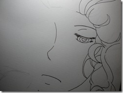
  • First, create a lineart, I draw my own drawings, this is one of them:
DSCN1053
 

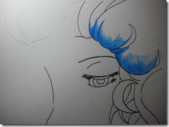
  • Colour what you want the atmosphere to feel like. in this one, I try to kind of, bring that sea, and night feeling so, for the hair near her face I want blue so here it is:
DSCN1054

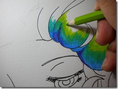
  • Again, I kind of want to darken the hair, and then I add the green one: green is used to continue the gradation and combination.
DSCN1057
  • Add a lighter green, like I said before, go to the light, in direction of the light.
DSCN1058
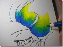
  • Now, enough with the light, lets continue with the dark colours. Between the first shade of green and the blue. And if you want to do a more balance gradation you can also shade dark blue between the first green and the second green.
  • Obviously, you saw the yellow, it’s to continue the shade of green. The yellow needs or for the best results use a light yellow, or a yellow that is close to lime green, or the green you’re using.
DSCN1059
  • Yellow goes with red, but let me tell you something, yellow + dark purpleish pink = reddish colour. This exceptional and incredible gradation and changes is one of the reason why you have to be careful and be brave.  TRY! TRY! TRY!
DSCN1060
  • Now, I’m just going to shade the skin around the eyes.
DSCN1061
  • The dark centre of the eye (I use drawing pen – Sakura Drawing Pen – )
DSCN1062
  • The eyes: light blue- blue
DSCN1063
  • DONE! Well that’s about the shading and layering the colours. Oh yeah, the final result, I will post it later! :) Thanks!
Oh yeah the colours I used: purple, blue, teal blue, dark green, lime green, yellow (light), dark purpleish pink.
Tools:
  1. Paper (sketchbook paper, copy paper, or anything)
  2. Pencil (2B and HB for sketching)
  3. Drawing pen (Sakura, i don’t know what size I’m using, between 0.3 to 0.5, around those sizes anyways)
  4. Colouring pencils . (I use Faber- Castells, the price isn’t too expensive)
  5. Eraser, to erase the sketch.
Tips:
  1. Be careful. Using different colours in one gradation/ layering them can surprise you! Watch out for negative surprises like the colouring can cause the picture too dark, not lively, or not colourful. But if you’re aiming for a dark atmosphere, use different dark colours and the light colours are just for highlights or to give a sense of life.
  2. Be brave. Be bold. Different colour can surprise you! Watch out for surprises! :D

That’s all for now! I’ll upload the final result soon!

- Keshia S