watercolour on watercolour paper.
-Keshia
I did this last night! Based on a postcard my brother gave me from US. San Francisco.
A little bit imaginary I think. Watercolour paint on watercolour paper.
-Keshia
I’ve been thinking about landscapes recently, and found drawing it very hard and amusing at the same time. Me, a person who don’t have nothing to do, or know what to do with perspective just drew something this morning. School was, you all know how school is. I’m thinking about an imaginative and magical place called “Not-School” And somewhere behind those ideas turn in to actions on a piece of paper. Pardon me, for being completely and utterly amateurish and feel intimidated by something like perspective. Yeah, the p word.PERSPECTIVE. Something that is really hard for me to draw with. Perspective can be a good partner and it can be an intimidating partner to be around with.
Sorry, for being such an amateur in perspective, this is what I did:
I tried. :)
-Keshia
When I made an artwork, I also consider when I scan this piece do I need a photoshop? Some works do need a Photoshop touch.
Caption: The left one is no-edited, the centre is lineart-only, the right one is the Photoshop edited version.
Photoshop helped us in so many ways. It brings out the colour if you set the settings. It really works and I really like working with it. Especially if the scanner made all of the colour fade, oh yes my friend, you really need a Photoshop help!
The usual ways I use in Photoshop: make a new layer above the original work. Colour the layer colourfully or just choose the colour that go well with the original work. Choose overlay.
Sometimes overlaying colour tends to make the colour disappear so, do with all your power to prevent that from happening, Photoshop will help you how!
Some person who sometimes like to edit with Photoshop,
- Keshia
During times of universal deceit, telling the truth becomes a revolutionary act.- George Orwell
You don’t know what will come in a strange deserted and black paper. When you put a little mark on it, your mind start to wonder. Like this blog. All along this blog was just an assignment but when I’m working on this blog, I really get in to it. For who ever is wondering what this blog is about (teacher, that’s you) This is an Art Blog, I just throw everything in here like this post is some kind of blank paper. Everything goes. For the next post, actually I don’t know what I’m going to talk about, another tutorial, another walkthrough maybe, or maybe some posting from my old blog. Oh yeah. my old blog. Let’s start with that shall we?
_______________________________________________________________________
I start my artwork "Having Fun, Boy?" 'cause of Owl City. I mean Owl City. The synthpop electronica one-man band. The songs are playful and fun, and so high imagination. The tunes go up and down, and synchronized with the lyrics, and the keyboard sound, and the singer vocals, play around the song make it so beautiful.
Because of the lyrics, I start building concepts. Concept I took for this piece is what the song said about the surroundings. It’s pretty descriptive sometimes, but it’s still pretty hard. What if I interpret this part that way, this way, maybe other ways? What about the lineart, the colors. Is it going to be dark and horror, or light and playful? It’s kind of hard when you start thinking about the lineart for a piece. Detailed or outline only? In the end “Having fun, Boy?” Probably is the hardest and most detailed artwork I’ve ever done. Mostly maybe because of dedication. :)
When you finished something (concept) sketching on a piece of paper made you turn your brain again. Because sometimes, not all of the concepts you’ve been thinking about is going to fit in one piece of paper. Remove this, remove that, there were a lot of erasing. Maybe I lost my eraser on the way.
A thing that I really troubled with in this artwork is the boy’s hand. Some part need some perspective (annoyed, I’m no good with this perspective) A thing that I really loved with in this artwork is not all the imaginative stuffs are real and they don’t really need perspective. Just let your imagination run wild! After I finished the sketch let’s get on with inking it.
Ink. Hard. Really now, I’m serious that this is hard. I mean, When you see the sketch, inking is one obstacle that you have to through. Key to inking: stable. Your hand must be steady and flow correctly, follow the lines you’ve made in the sketching step. Watch out for details and if you want to change something in the inking stage you better think twice, be careful.
I color the picture a few days after the inking and the coloring takes a few days as well (including the art block of colors) I mostly used faber-castells classic color pencils, but to smooth the boy's and angel's face I used faber-castel;s watercolor pencils. Why watercolor for the face? Because it much more smoother than If I used coloured pencils. Most of the technique or ways are gradation and layering (check out my First Post ) I really like this process although it took me so long just to finish it.
Tools:
That’s about my artwork,
- Keshia
Hi guys! I’m back with the walkthrough for ya! So after Moon Cloud - Walkthrough Part 1- there is part 2, this one! Mostly we’re going to talk about the clouds on Moon Cloud. The clouds will be colourful, mysterious and bizarre! So let’s go
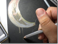
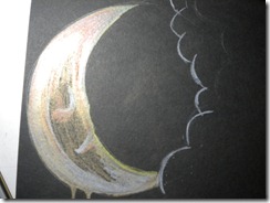
After I finish the moon (see my previous post) let’s continue with the clouds. First of all, is the light. If you see the moon it have this reflective yellow colour from the cloud, so the cloud is the source of light. I’m using yellow metallic pencils with some help from white coloured pencils. The start is from the upper part of the paper to the end part. I shade from top to bottom the shading get thinner and thinner which means that the light is slowly disappearing from the cloud.
Next, I made a cloud inside the big cloud (it’s to separate the colour so it doesn’t get mixed up and ended up weird) I begin with a light shade of green (metallic green) and as I go to the bottom of the small cloud, the shade should get thicker. Why? Because when I finished with the small cloud, I will do the big cloud again that will have a different shading (the big cloud should be not as thick as the small cloud) According to me anyways.
After finished the green colour, lets make a gradation using blue. I like to make it thick (^_^) It’s fun :) Gradation can be done with this metallic pencils and you can smooth the gradation with brush and water. Metallic pencils work with water well.
Continue the gradation like I usually do. Purple and Pink what more can you ask for? Shade it with the same direction as you shade before. If you don’t shade it like the way you did before, it becomes weird and un-enchanting. For me when I’m using metallic pencils the gradation are: Green – Blue – Purple – Pink – Red – Copper – Yellow – Gold . I like to put silver between green and blue, because it give that cold feeling. And for Red, Yellow and Gold I like to put Copper because it almost look like orange in the regular coloured pencils.
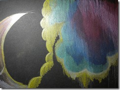
Next, as I said before I put silver between green blue yes, I did. Silver and White between green and blue and across the pink and purple, why? Because I want to give it a speed appeal and apocalyptic for some reason.Let’s continue to the big cloud :)
The big cloud is really simple. The gradations are: Yellow – White – Red – Pink – Copper.
Because the copper is near the finishing point, I made it the biggest shade of the whole picture. The techniques are the same with the small cloud. You think you need special methods when using metallic pencils? Oh no, think again my friend, no. Just have fun like you have fun using regular coloured pencils. Like me :)
This is the finished product:
(My bad camera) Okay that’s for now!
- Keshia
