Hi guys! I’m back with the walkthrough for ya! So after Moon Cloud - Walkthrough Part 1- there is part 2, this one! Mostly we’re going to talk about the clouds on Moon Cloud. The clouds will be colourful, mysterious and bizarre! So let’s go
After I finish the moon (see my previous post) let’s continue with the clouds. First of all, is the light. If you see the moon it have this reflective yellow colour from the cloud, so the cloud is the source of light. I’m using yellow metallic pencils with some help from white coloured pencils. The start is from the upper part of the paper to the end part. I shade from top to bottom the shading get thinner and thinner which means that the light is slowly disappearing from the cloud.
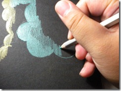
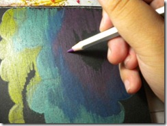
Next, I made a cloud inside the big cloud (it’s to separate the colour so it doesn’t get mixed up and ended up weird) I begin with a light shade of green (metallic green) and as I go to the bottom of the small cloud, the shade should get thicker. Why? Because when I finished with the small cloud, I will do the big cloud again that will have a different shading (the big cloud should be not as thick as the small cloud) According to me anyways.
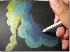
After finished the green colour, lets make a gradation using blue. I like to make it thick (^_^) It’s fun :) Gradation can be done with this metallic pencils and you can smooth the gradation with brush and water. Metallic pencils work with water well.
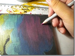
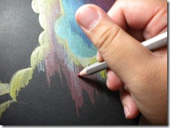
Continue the gradation like I usually do. Purple and Pink what more can you ask for? Shade it with the same direction as you shade before. If you don’t shade it like the way you did before, it becomes weird and un-enchanting. For me when I’m using metallic pencils the gradation are: Green – Blue – Purple – Pink – Red – Copper – Yellow – Gold . I like to put silver between green and blue, because it give that cold feeling. And for Red, Yellow and Gold I like to put Copper because it almost look like orange in the regular coloured pencils.
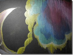
Next, as I said before I put silver between green blue yes, I did. Silver and White between green and blue and across the pink and purple, why? Because I want to give it a speed appeal and apocalyptic for some reason.Let’s continue to the big cloud :)
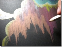
The big cloud is really simple. The gradations are: Yellow – White – Red – Pink – Copper.
Because the copper is near the finishing point, I made it the biggest shade of the whole picture. The techniques are the same with the small cloud. You think you need special methods when using metallic pencils? Oh no, think again my friend, no. Just have fun like you have fun using regular coloured pencils. Like me :)
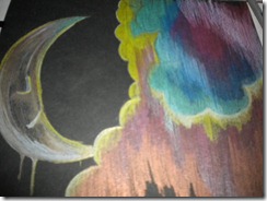
This is the finished product:
(My bad camera) Okay that’s for now!
- Keshia


No comments:
Post a Comment